
Creating Stunning Gradients in React Native with Skia
·
Learn how to create stunning text with React Native using React Native Skia. In this post, we’ll explore how to leverage Skia’s powerful features to bring vibrant gradients to life.
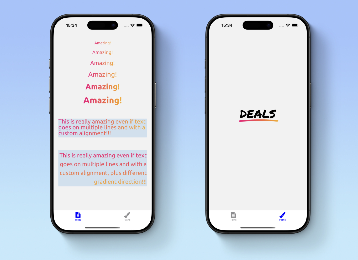
As I mentioned in my latest post, we’ve been working on some exciting new features and projects for our mobile apps. One of these required creating stunning gradient text with custom, eye-catching shapes.
In the past, I’ve already shared how much I love react-native-skia and how it empowers developers to create impressive 2D graphics. Recently, we integrated the library into our mobile apps and migrated some custom shapes to use this framework, such as the one mentioned in the article above.
That previous implementation was a simple shape using our primary color. This time, Antonino Gitto and I had to push the boundaries further: we were asked to create custom text and shapes featuring gradient colors.
Our goal was to achieve the effects shown in the image below.
Naturally, we chose to use react-native-skia again because:
- It gives us the flexibility to create complex custom shapes while also allowing us to reuse SVG primitives designed by our team.
- It provides extensive support for gradients with plenty of customization options.
Implementation
Let's implement the gradient text component shown in the first screen above. To build this component, we will leverage
the power of the Paragraph, LinearGradient, Mask, and Rect APIs
from react-native-skia.
The most challenging parts of the implementation are:
Textin react-native-skia supports gradients through composition with theLinearGradientshader component. However, our text is not static, and we need to perform text layout operations such as setting a custom font, adjusting line height, font weight, text alignment, and font size.- The text has a dynamic size, meaning we need a way to calculate the dimensions of the
Paragraphso that we can properly adapt theMaskthat applies it and theRectthat contains theLinearGradient.
How can we achieve this? First, our component will be called GradientText, and it will expose customizable properties: gradient colors and
positions, as well as text styling.
interface Gradient {
    colors: string[];
    startPercentages: [number, number];
    endPercentages: [number, number];
}

interface FontStyle {
    size: number;
    weight: GradientFontWeight;
    alignment: GradientTextAlignment;
    lineHeight: number;
}

interface GradientTextProps {
    text: string;
    fontStyle: FontStyle;
    gradient: Gradient;
    containerStyle?: ViewStyle;
}

export const GradientText: React.FC<GradientTextProps> = //...implementation...
We will use the Ubuntu font, which can be loaded using the useFonts hook
from react-native-skia. This hook returns a
SkTypefaceFontProvider, which we store in customFontMgr.
Since the Paragraph depends on the font being available, we do nothing until the font is loaded. Once customFontMgr
is ready, we can create the Paragraph using a ParagraphBuilder provided by the library.
In the builder's Make method, we define text properties such as alignment and pass customFontMgr as a required
parameter. We also adapt our props to match Skia's expected values using maps we created: like skiaTextAlign (for
text alignment) and skiaFontWeight (for font weight).
const paragraph = useMemo(() => {
    if (!customFontMgr) {
        return null;
    }

    return Skia
        .ParagraphBuilder
        .Make({textAlign: skiaTextAlign[fontStyle.alignment]}, customFontMgr)
        .pushStyle({
            fontFamilies: [fontFamilyName],
            fontSize: fontStyle.size,
            fontStyle: {
                weight: skiaFontWeight[fontStyle.weight],
            },
            color: Skia.Color('black'),
            heightMultiplier: fontStyle.lineHeight,
        })
        .addText(text)
        .build();
}, [customFontMgr]);
At this point, we are ready to render our gradient text—or are we? 😏 As mentioned earlier, our text has dynamic
dimensions, but the LinearGradient shader requires explicit width and height values when used with Rect.
Additionally, we need to ensure that the gradient only fills the text itself and not the entire Rect.
Fortunately, react-native-skia provides a built-in
layout method for Paragraph, which allows us to compute the text dimensions. We use this method to determine the
Canvas, Mask, and Rect dimensions.
paragraph.layout(Dimensions.get('window').width);

const paragraphHeight = paragraph.getHeight() + paragraphPadding;
const paragraphWidth = paragraph.getLongestLine() + paragraphPadding;

const canvasStyle: ViewStyle = {
    width: paragraphWidth,
    height: paragraphHeight,
    ...containerStyle,
};
Now, we can compose all the components together. We start with the Canvas, using the computed styles. Then, we create
the Mask, which applies the Paragraph as a mask in alpha mode (based on opacity). Inside the Mask, we draw a
Rect of the same size and apply the LinearGradient, ensuring that it is masked by the Paragraph.
A key challenge here is distributing the gradient dynamically based on text dimensions. Instead of using fixed
positions, the Gradient props include startPercentages and endPercentages, allowing the gradient to adjust
dynamically.
return (
    <Canvas style={canvasStyle}>
        <Mask
            mode={'alpha'}
            mask={<Paragraph paragraph={paragraph} x={0} y={0} width={paragraphWidth}/>}>
            <Rect x={0} y={0} width={paragraphWidth} height={paragraphHeight}>
                <LinearGradient
                    start={vec(
                        gradient.startPercentages[0] * paragraphWidth,
                        gradient.startPercentages[1] * paragraphHeight,
                    )}
                    end={vec(
                        gradient.endPercentages[0] * paragraphWidth,
                        gradient.endPercentages[1] * paragraphHeight,
                    )}
                    colors={gradient.colors}
                />
            </Rect>
        </Mask>
    </Canvas>
);
With this approach, the gradient dynamically adapts to the text dimensions without requiring explicit width and height props. The component performs all necessary calculations internally, making it flexible and reusable.
Below, you can find the complete implementation of this component.
import React, {useMemo} from 'react';
import {
    Canvas,
    FontWeight,
    LinearGradient,
    Mask,
    Paragraph,
    Rect,
    Skia,
    TextAlign,
    useFonts,
    vec,
} from '@shopify/react-native-skia';
import {Dimensions, ViewStyle} from 'react-native';

const fontFamilyName = 'Ubuntu';
const paragraphPadding = 5;

export enum GradientFontWeight {
    Regular = 400,
    Bold = 700,
}

export enum GradientTextAlignment {
    Left = 0,
    Right = 1,
    Center = 2,
}

const skiaFontWeight: Record<GradientFontWeight, FontWeight> = {
    [GradientFontWeight.Regular]: FontWeight.Normal,
    [GradientFontWeight.Bold]: FontWeight.Bold
}

const skiaTextAlign: Record<GradientTextAlignment, TextAlign> = {
    [GradientTextAlignment.Center]: TextAlign.Center,
    [GradientTextAlignment.Left]: TextAlign.Left,
    [GradientTextAlignment.Right]: TextAlign.Right,
}

interface Gradient {
    colors: string[];
    startPercentages: [number, number]
    endPercentages: [number, number]
}

interface FontStyle {
    size: number;
    weight: GradientFontWeight;
    alignment: GradientTextAlignment;
    lineHeight: number
}

interface GradientTextProps {
    text: string;
    fontStyle: FontStyle;
    gradient: Gradient
    containerStyle?: ViewStyle;
}

export const GradientText: React.FC<GradientTextProps> = ({
                                                              text,
                                                              fontStyle,
                                                              gradient,
                                                              containerStyle,
                                                          }) => {
    const customFontMgr = useFonts({
        [fontFamilyName]: [
            require(`../assets/fonts/Ubuntu-Bold.ttf`),
            require(`../assets/fonts/Ubuntu-Regular.ttf`),
        ],
    });

    const paragraph = useMemo(() => {
        if (!customFontMgr) {
            return null;
        }

        return Skia
            .ParagraphBuilder
            .Make({textAlign: skiaTextAlign[fontStyle.alignment]}, customFontMgr)
            .pushStyle({
                fontFamilies: [fontFamilyName],
                fontSize: fontStyle.size,
                fontStyle: {
                    weight: skiaFontWeight[fontStyle.weight]
                },
                color: Skia.Color('black'),
                heightMultiplier: fontStyle.lineHeight
            })
            .addText(text)
            .build();
    }, [customFontMgr]);

    if (!paragraph) {
        return null
    }

    paragraph.layout(Dimensions.get('window').width);

    const paragraphHeight = paragraph.getHeight() + paragraphPadding;
    const paragraphWidth = paragraph.getLongestLine() + paragraphPadding;

    const canvasStyle: ViewStyle = {
        width: paragraphWidth,
        height: paragraphHeight,
        ...containerStyle,
    };

    return (
        <Canvas style={canvasStyle}>
            <Mask
                mode={'alpha'}
                mask={<Paragraph paragraph={paragraph} x={0} y={0} width={paragraphWidth}/>}>
                <Rect x={0} y={0} width={paragraphWidth} height={paragraphHeight}>
                    <LinearGradient
                        start={vec(
                            gradient.startPercentages[0] * paragraphWidth,
                            gradient.startPercentages[1] * paragraphHeight,
                        )}
                        end={vec(
                            gradient.endPercentages[0] * paragraphWidth,
                            gradient.endPercentages[1] * paragraphHeight,
                        )}
                        colors={gradient.colors}
                    />
                </Rect>
            </Mask>
        </Canvas>
    );
};
Let's move on with the second component we needed (check the screenshot again to see what are we talking about). We needed to show the text "DEALS" with an underline colored with a gradient.
We will call this component PromotionTextWithPath.
This component leverages (again) the power of Skia to draw a dynamic shape under the text, styled with a gradient.
We have some goal to achieve with our custom implementation. In particular, the underline should:
- Scale dynamically based on the text dimensions.
- Be positioned correctly under the text.
- Feature a gradient that spans the entire underline.
To achieve this, we use Skia’s Path, Mask, and LinearGradient components. The key challenge for this component lies in calculating the dimensions and position of the underline dynamically based on the text layout.
For this we will implement a function called onDealsTextLayout, that is the heart of this component.
This is the heart of the implementation of the component that will be attached to the Text that contains the "DEALS" text.
In this way we can calculate the dimensions and position of the underline based on the layout of the text. Let’s break it down the function that you can see below.
const onDealsTextLayout = (event: LayoutChangeEvent) => {
    const {width, height} = event.nativeEvent.layout;

    // Calculate the underline width as a multiplier of the text width.
    const underlineWidth = width * UNDERLINE_MULTIPLIER_FACTOR;

    // Scale the underline height proportionally to the font size.
    const underlineHeight = (BASE_UNDERLINE_HEIGHT * styles.deals.fontSize) / BASE_TEXT_LINE_HEIGHT;

    // Calculate scaling factors for the underline shape.
    const scalingFactorWidth = (width / BASE_UNDERLINE_WIDTH) * UNDERLINE_MULTIPLIER_FACTOR;
    const scalingFactorHeight = underlineHeight / BASE_UNDERLINE_HEIGHT;

    // Calculate the top position of the underline relative to the text.
    const paddingBottom = (height - styles.deals.fontSize) / 2;
    const topPosition = height - paddingBottom + paddingBottom * TOP_POSITION_ADDITIONAL_PADDING;

    setUnderlineConfig({
        width: underlineWidth,
        height: underlineHeight,
        scalingFactorWidth,
        scalingFactorHeight,
        topPosition,
    });
};
The key calculations are:
-
underline width: The width of the underline is calculated as a multiplier of the text width. This ensures that the underline dynamically adjusts to the text size. This multiplier has been extracted from the original mockup, where the underline has a width that is 110% the size of the text.
-
underline height: The height is scaled proportionally to the font size and the line height (starting from
BASE_UNDERLINE_HEIGHTandBASE_TEXT_LINE_HEIGHTthat are the original dimensions of the component in the mockup), maintaining a consistent appearance across different text sizes. -
scaling factors: The
scalingFactorWidthandscalingFactorHeightare used to scale the SVG path of the underline to match the calculated dimensions. This scaling factor are applied to thePathcomponent, so that we can scale the original SVG to match the dimensions of the text. -
top position: The
topPositiondetermines the vertical placement of the underline. It is calculated based on the text height and additional padding to ensure proper alignment. In particular, the padding is calculate in terms of the font size, . Additionally, we had to adjust it based on the original mockup padding dimesions (0.2)
Once the dimensions and position are calculated, we use Skia components to render the underline. The Canvas serves as the container, and the Mask applies the SVG path as a mask. Inside the Mask, we draw a Rect filled with a LinearGradient.
return (
    <View style={styles.container}>
        <Text
            style={styles.deals}
            onLayout={onDealsTextLayout}
            numberOfLines={1}>
            DEALS
        </Text>
        {underlineConfig && (
            <Canvas
                style={{
                    width: Math.ceil(underlineConfig.width),
                    height: Math.ceil(underlineConfig.height),
                    position: 'absolute',
                    top: underlineConfig.topPosition,
                    right: -(underlineConfig.width * 0.05),
                }}>
                <Mask
                    mode={'alpha'}
                    mask={
                        <Path
                            path={SVG_UNDERLINE}
                            color={"#000000"}
                            transform={[
                                {
                                    scaleX: underlineConfig.scalingFactorWidth,
                                },
                                {
                                    scaleY: underlineConfig.scalingFactorHeight,
                                },
                            ]}
                        />
                    }>
                    <Rect
                        x={0}
                        y={0}
                        width={underlineConfig.width}
                        height={underlineConfig.height}>
                        <LinearGradient
                            start={vec(0, underlineConfig.height / 2)}
                            end={vec(underlineConfig.width, underlineConfig.height / 2)}
                            colors={['#F2007C', '#F7AF17']}
                        />
                    </Rect>
                </Mask>
            </Canvas>
        )}
    </View>
);
Here’s the complete implementation of the PromotionTextWithPath component. In it you will find also the base SVG shape of the underline path, plus all the multiplier used to do the calculation in the onDealsLayout that we mentioned before.
import React from 'react';
import {Canvas, LinearGradient, Mask, Path, Rect, vec,} from '@shopify/react-native-skia';
import {LayoutChangeEvent, StyleSheet, Text, View,} from 'react-native';

const SVG_UNDERLINE =
    'M1.83778 3C1.07806 3 0.407248 2.69942 0.253688 2.26222C0.0839635 1.77037 0.649712 1.29218 1.53066 1.19199C2.43586 1.09179 23.9909 -1.2354 46.5642 0.895963C47.4452 0.977939 48.0433 1.44702 47.8897 1.94343C47.7442 2.43983 46.9118 2.77229 46.0308 2.69032C24.0475 0.622712 2.36312 2.95901 2.1449 2.98178C2.03984 2.99545 1.93477 3 1.8297 3H1.83778Z';

const BASE_UNDERLINE_WIDTH = 48;
const BASE_UNDERLINE_HEIGHT = 3;
const BASE_TEXT_LINE_HEIGHT = 14;
const UNDERLINE_MULTIPLIER_FACTOR = 1.1;
const TOP_POSITION_ADDITIONAL_PADDING = 0.2;

type UnderlineConfig = {
    width: number;
    height: number;
    scalingFactorWidth: number;
    scalingFactorHeight: number;
    topPosition: number;
};

export const PromotionTextWithPath: React.FC = () => {
    const [underlineConfig, setUnderlineConfig] = React.useState<UnderlineConfig | undefined>(undefined);

    const onDealsTextLayout = (event: LayoutChangeEvent) => {
        const {width, height} = event.nativeEvent.layout;

        const underlineWidth = width * UNDERLINE_MULTIPLIER_FACTOR;
        const underlineHeight = (BASE_UNDERLINE_HEIGHT * styles.deals.fontSize) / BASE_TEXT_LINE_HEIGHT;

        const scalingFactorWidth = (width / BASE_UNDERLINE_WIDTH) * UNDERLINE_MULTIPLIER_FACTOR;
        const scalingFactorHeight = underlineHeight / BASE_UNDERLINE_HEIGHT;

        const paddingBottom = (height - styles.deals.fontSize) / 2;
        const topPosition = height - paddingBottom + paddingBottom * TOP_POSITION_ADDITIONAL_PADDING;

        setUnderlineConfig({
            width: underlineWidth,
            height: underlineHeight,
            scalingFactorWidth,
            scalingFactorHeight,
            topPosition,
        });
    };

    return (
        <View style={styles.container}>
            <Text
                style={styles.deals}
                onLayout={onDealsTextLayout}
                numberOfLines={1}>
                DEALS
            </Text>
            {underlineConfig && (
                <Canvas
                    style={{
                        width: Math.ceil(underlineConfig.width),
                        height: Math.ceil(underlineConfig.height),
                        position: 'absolute',
                        top: underlineConfig.topPosition,
                        right: -(underlineConfig.width * 0.05),
                    }}>
                    <Mask
                        mode={'alpha'}
                        mask={
                            <Path
                                path={SVG_UNDERLINE}
                                color={"#000000"}
                                transform={[
                                    {
                                        scaleX: underlineConfig.scalingFactorWidth,
                                    },
                                    {
                                        scaleY: underlineConfig.scalingFactorHeight,
                                    },
                                ]}
                            />
                        }>
                        <Rect
                            x={0}
                            y={0}
                            width={underlineConfig.width}
                            height={underlineConfig.height}>
                            <LinearGradient
                                start={vec(0, underlineConfig.height / 2)}
                                end={vec(underlineConfig.width, underlineConfig.height / 2)}
                                colors={['#F2007C', '#F7AF17']}
                            />
                        </Rect>
                    </Mask>
                </Canvas>
            )}
        </View>
    );
};

const styles = StyleSheet.create({
    container: {
        flexDirection: 'row',
        alignItems: 'center',
    },
    deals: {
        fontSize: 48,
        fontFamily: 'PermanentMarker-Regular'
    },
});
Conclusion
The codebase with the implementation above can be found in this GitHub repository. We’re constantly pushing the boundaries of what’s possible with React Native and Skia, and this is just the beginning! 🚀 By leveraging high-performance libraries like Skia, we’re not only improving the UI of our apps but also ensuring they run smooth.
But wait, there’s more! This is just one of the many exciting features we’re working on. Stay tuned for upcoming posts where we’ll dive into other beautiful skia components and animation with React Native Reanimated.
The best is yet to come! ❤️

